New York Regional Ferries Website
A responsive website to consolidate regional ferry services
New York's ferry usage is on the rise but New Yorkers currently do not have a single resource to compare and consolidate all these services into one interface.

Role
Research UX Design
Tools
Figma, Notion, Photoshop, Illustrator
Timeline
100 Hours
Can we create a single website to unify all the ferry lines?
Background
The New York region has a large number of ferries. There are private commuter ferries and free public ones like the Staten Island Ferry. Others, like the Circle Line, are tourist and leisure-focused, offering higher priced trips that provide views of important cultural sites. The largest service available is the the NYC Ferry program which has been beloved by commuters and visitors since its introduction in 2017.
Problem
Currently, the landscape is filled by a number of players that overlap in geographically but serve different audiences and the uses but are not integrated within one interface or source. How does one know that New Jersey shore could be reached by ferry?
Goals
The goal of designing the New York Regional Ferry website is to fill this gap with the greater goal of supporting sustainable transit to reduce congestion, increase awareness of public transit options, and allow New Yorkers a means to experience the natural geography in a new way.
The NYRF website is a responsive site that serves as a resource for ferry planning by placing importance on:


The NYRF website is a responsive site that serves as a resource for ferry planning by placing importance on:
The NYRF website is a responsive site that serves as a resource for ferry planning by placing importance on:
consolidation of all the transit lines in one regional map with all landings and routes
using recognizable transit design patterns and map-based search
increasing the practicality of ferry transit through integration with other transit systems to focus on door-to-door transit
increasing confidence in the reliability of the ferry through realtime schedule , weather, and delay information
focusing on smartphone ticket handoff
providing transparency of transit options and prices
Discover
We want to know how users plan trips and find and buy tickets so that we can better serve their needs, reduce the friction of the ferry website experience.
User Interviews
I conducted one-on-one interviews with potential ferry users to understand their needs, behaviors, and pain points (approximately 4-5 interviews lasting 30-45 minutes)
Competitive Assessment
I evaluated existing ferry websites, focusing on usability, design, and features. This will provide insights into industry standards and identify unique differentiators that can be incorporated into the new website.
We want to know how users discover, plan trips, and buy tickets to understand how to improve the experience.
We want to know how users discover, plan trips, and buy tickets to understand how to improve the experience.
We want to know how users discover, plan trips, and buy tickets to understand how to improve the experience.
Read Further
Read Further
Read Further
Who is out there doing what we want to do already?
We evaluated existing ferry websites, focusing on usability, design, and features to provide insights into industry standards and identify unique differentiators that can be incorporated into the new website.


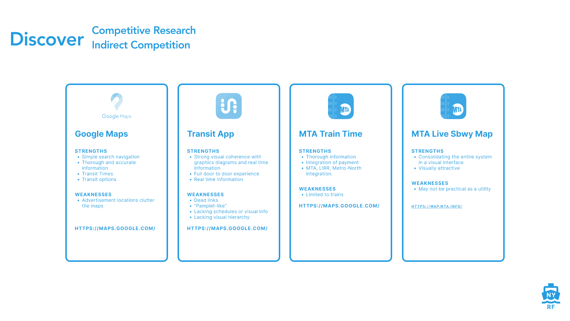
Who is out there doing what we want to do already?
We evaluated existing ferry websites, focusing on usability, design, and features to provide insights into industry standards and identify unique differentiators that can be incorporated into the new website.
Who is out there doing what we want to do already?
We evaluated existing ferry websites, focusing on usability, design, and features to provide insights into industry standards and identify unique differentiators that can be incorporated into the new website.
Define
Given what I had learned through the research phase I synthesized the data I had gathered from interviews to determine a number of recurring themes. Afterward, I created prototypical personas to embody the needs.
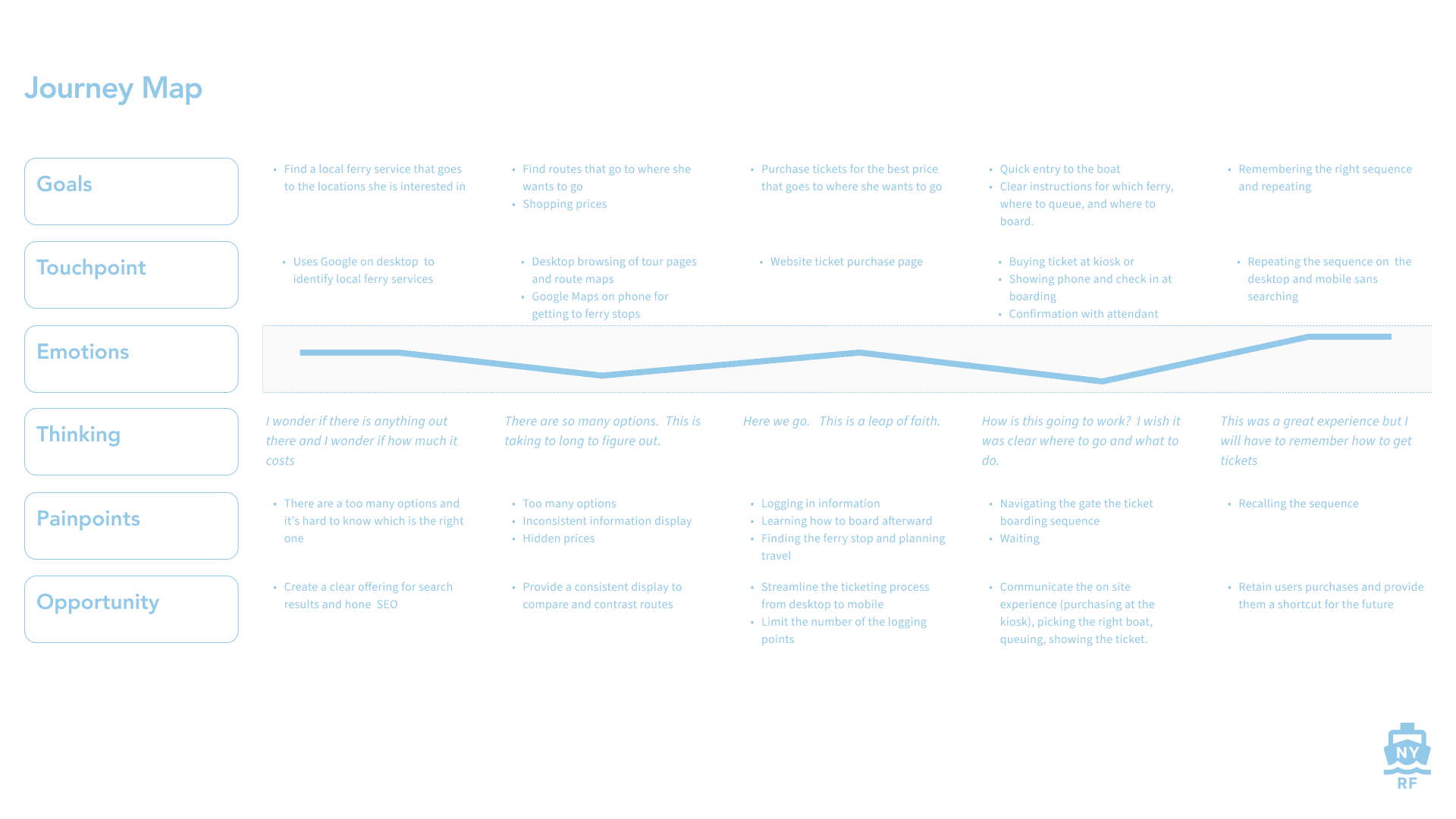
I envisioned how this journey would play out for these personas in a journey map.
framed the problem in Point of View and How Might We exercises.
Define
Given what I had learned through the research phase I synthesized the data I had gathered from interviews to determine a number of recurring themes. Afterward, I created prototypical personas to embody the needs.
I envisioned how this journey would play out for these personas in a journey map.
framed the problem in Point of View and How Might We exercises.
The interviews yielded a number of interesting themes. By gathering all of the information patterns started to emerge; we gathered them and categorized them based on the themes and the results were as follows:
The Ferry is Unreliable
Users tend toward leisure use and do not consider this a serious transit option. For them, the landings are inconvenient or the lines not plentiful enough.
Timetables Are Frustrating
Timetables and departure times are the most important thing to know. However, traditional timetables can be difficult to read.
Realtime Visualization is Useful
Waiting is a huge painpoint for users of all forms of transit. Maps, realtime locations, capacity, countdown clocks are useful.
Visualizing Realtime Information: Waiting & Weather are Painpoints
Weather was cited as a major painpoint in the use of the ferry.
Painpoint: Ticketing
The convenience of a “tap & go” with a smartphone is ideal for a lot of people. There is a reluctance to onboard for infrequent users.
Painpoint: Boarding
Sometimes users approach the ferry as it arrives and need to board rapidly. This can be an especially chaotic situation.
Pain Point: Getting to the Boat
The impracticality of the ferry locations is a painpoint. The lack of integration with other transit systems physically and digitally is also a problem.
Following affinity mapping, we developed POV's (Points of View) based on the themes. We painted a picture of the situation and proceeded to ask the questions and determine the problems we need to solve:
POV
I'd like to explore ways to help leisure users find scenic and tourist experiences
HMW
How might we guide riders to discover new experiences and routes?
THOUGHTS
Users tend toward leisure use and do not consider this a serious form of travel
ACTIONS
Cater the app toward leisure users by emphasizing the experience (what to see, to do)
POV
I’d like like to explore ways to clarify and visualize the experience to increase their confidence in ferry commuting and transit
HMW
How might we help riders plan their routes based on their destination?
THOUGHTS
Visualization will alleviate the anxiety and ambiguity and help in transit planning
ACTIONS
Enact design patterns that other transit websites utilize for familiarity
POV
I’d like like to explore ways to help riders clarify and visualize the experience to increase their confidence in the ferry service as a serious commuting and transit service
HMW
How might we help riders visualize important realtime information riders to alleviate the anxiety of ambiguity, delays, rushed boarding, geography?
THOUGHTS
Maps, realtime locations, current capacity, countdown clocks, and distances are useful. Waiting is a huge painpoint for users but displaying countdown clocks can demystify the process
ACTIONS
Leverage realtime information to make it clearer for riders when the boats are coming
POV
I’d like like to explore ways to help riders seamlessly plan, buy tickets, travel, and board the ferry without feeling rushed, stressed, and anxious.
HMW
How might we make the boarding process simple and seamless for riders from the planning stage onward?
THOUGHTS
Sometimes users approach teh ferry as it arrives and need to board rapidly. This can be an especially chaotic situation.
ACTIONS
Design a desktop-to-mobile ticket handoff experience that is easy, simple, fluid, and reduces stress while boarding
POV
I'd like to explore ways to help leisure users find scenic and tourist experiences
HMW
How might we guide riders to discover new experiences and routes?
THOUGHTS
Users tend toward leisure use and do not consider this a serious form of travel
ACTIONS
Cater the app toward leisure users by emphasizing the experience (what to see, to do)
POV
I’d like like to explore ways to clarify and visualize the experience to increase their confidence in ferry commuting and transit
HMW
How might we help riders plan their routes based on their destination?
THOUGHTS
Visualization will alleviate the anxiety and ambiguity and help in transit planning
ACTIONS
Enact design patterns that other transit websites utilize for familiarity
POV
I’d like like to explore ways to help riders clarify and visualize the experience to increase their confidence in the ferry service as a serious commuting and transit service
HMW
How might we help riders visualize important realtime information riders to alleviate the anxiety of ambiguity, delays, rushed boarding, geography?
THOUGHTS
Maps, realtime locations, current capacity, countdown clocks, and distances are useful. Waiting is a huge painpoint for users but displaying countdown clocks can demystify the process
ACTIONS
Leverage realtime information to make it clearer for riders when the boats are coming
POV
I’d like like to explore ways to help riders seamlessly plan, buy tickets, travel, and board the ferry without feeling rushed, stressed, and anxious.
HMW
How might we make the boarding process simple and seamless for riders from the planning stage onward?
THOUGHTS
Sometimes users approach teh ferry as it arrives and need to board rapidly. This can be an especially chaotic situation.
ACTIONS
Design a desktop-to-mobile ticket handoff experience that is easy, simple, fluid, and reduces stress while boarding
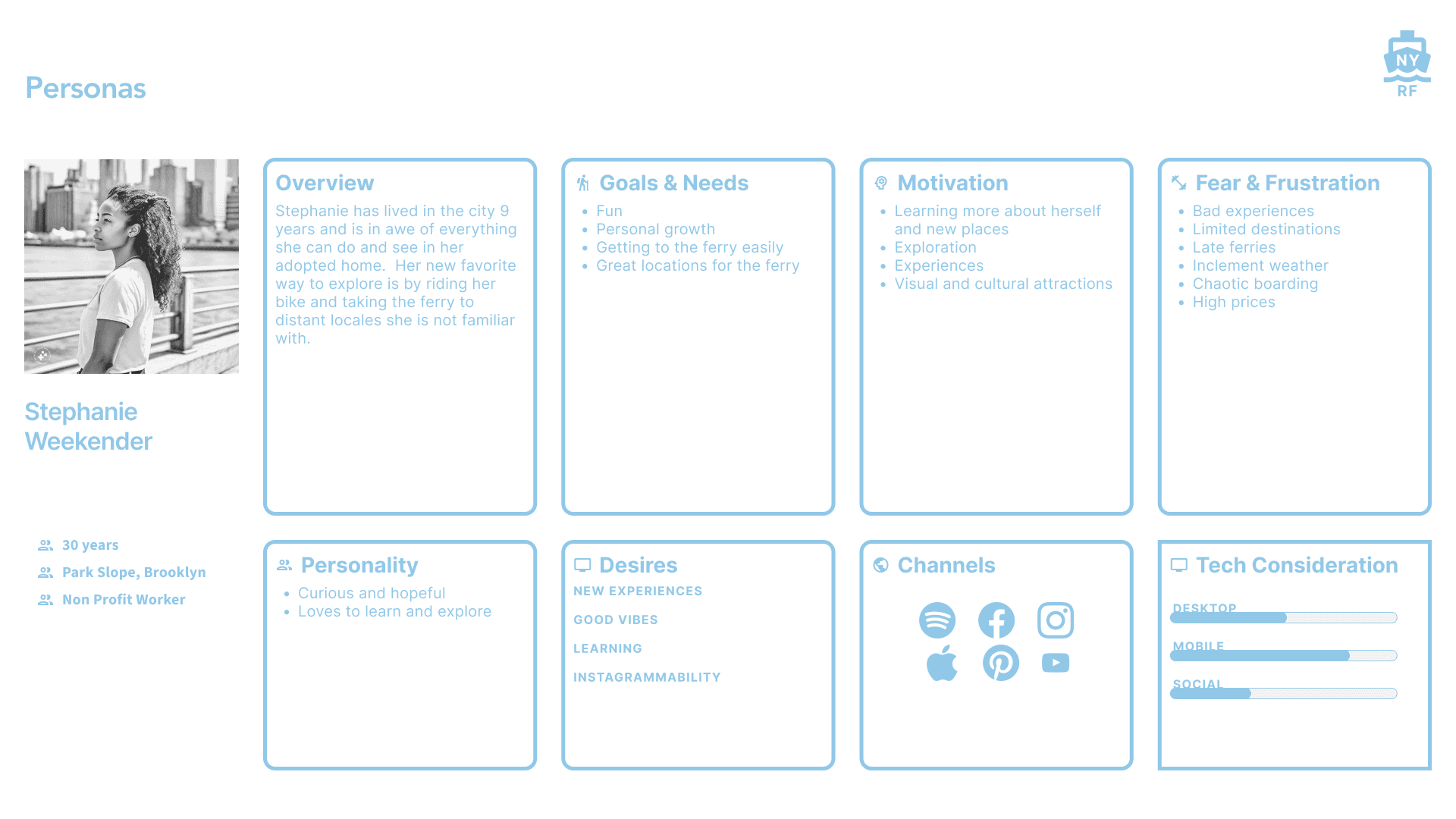
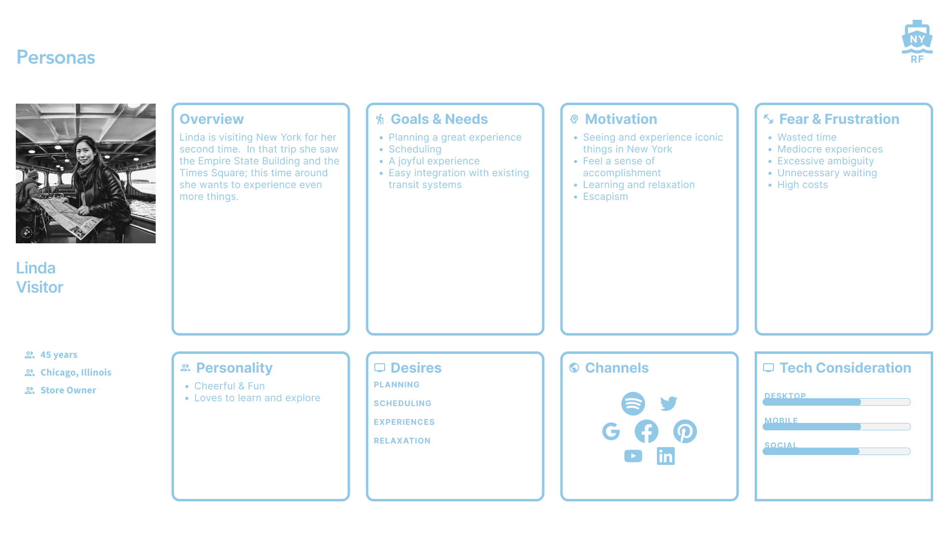
Armed with a number user issues we created archetypal user personas to embody our discoveries. Three types of archetypal users that embody the overarching needs we determined:
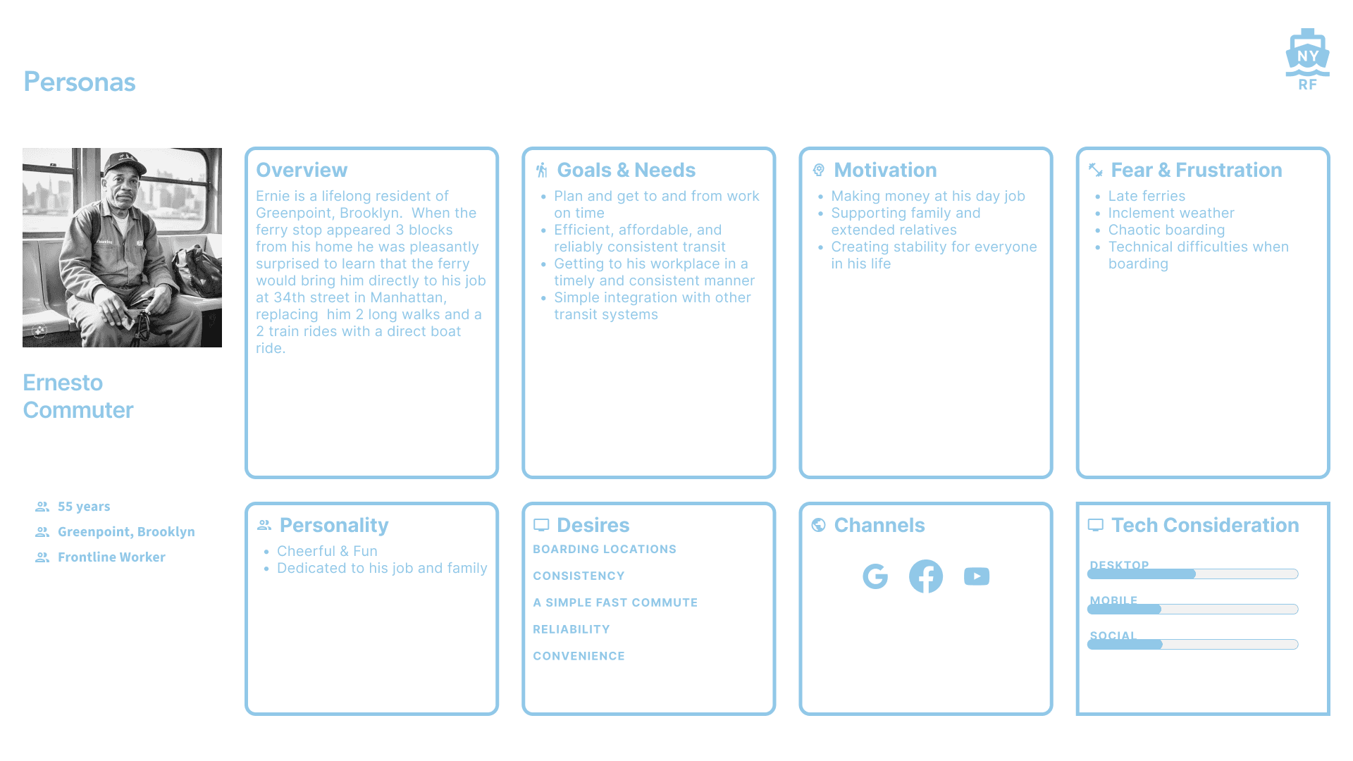
Armed with a number user issues we created archetypal user personas to embody our discoveries. Three types of archetypal users that embody the overarching needs we determined:
Armed with a number user issues we created archetypal user personas to embody our discoveries. Three types of archetypal users that embody the overarching needs we determined:
Develop
After framing the right questions and a frameworks we developed initial passes at structuring the website and creating the website
Develop
After framing the right questions and a frameworks we developed initial passes at structuring the website and creating the website
Develop
After framing the right questions and a frameworks we developed initial passes at structuring the website and creating the website
The sitemap seeks to be a simple and based around the map, routes, landings, and experiences.
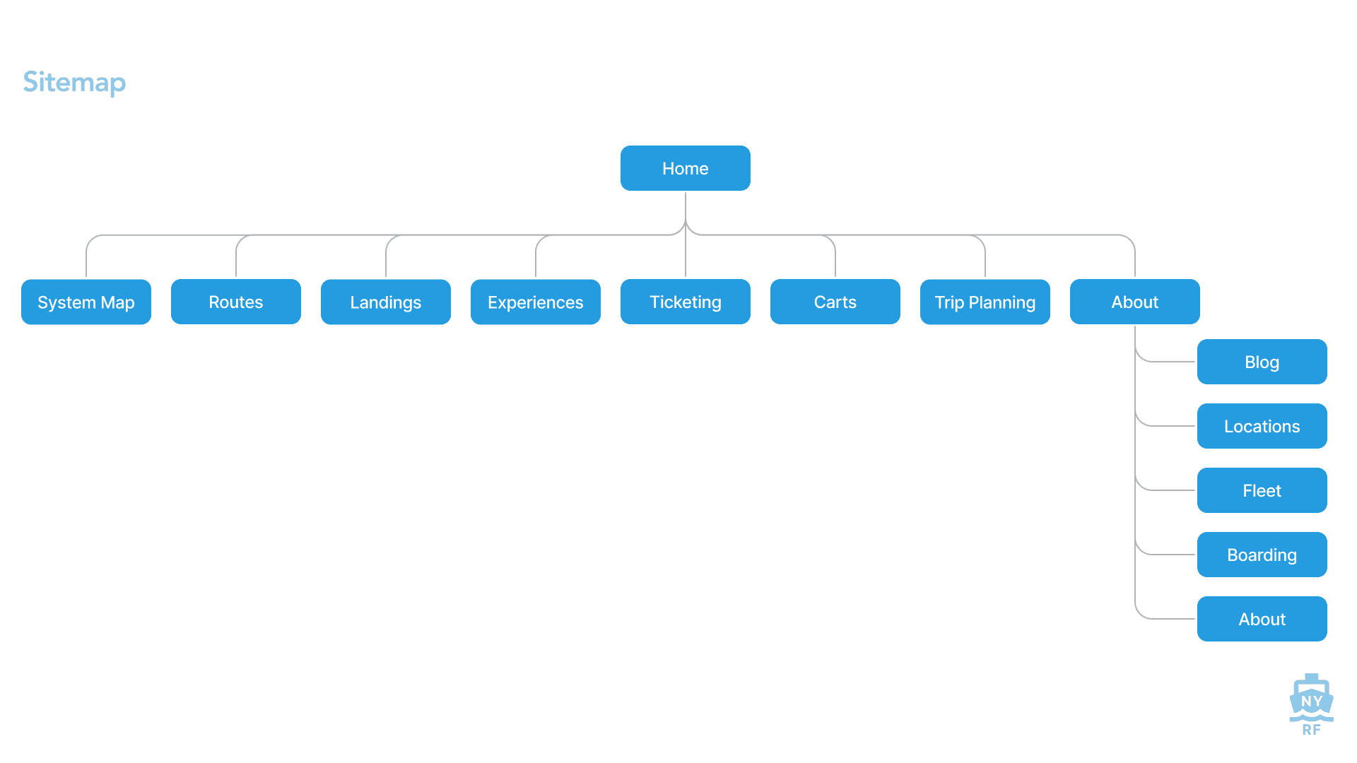
The sitemap seeks to be a simple and based around the map, routes, landings, and experiences.
The sitemap seeks to be a simple and based around the map, routes, landings, and experiences.
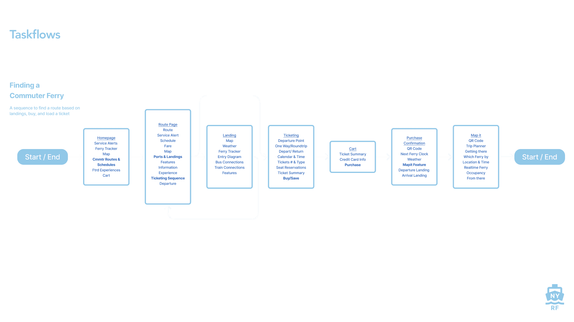
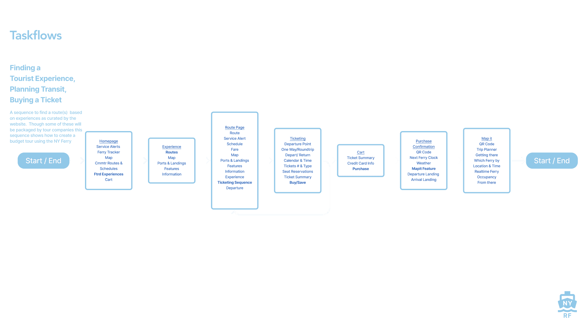
Developing the taskflows corresponds with the user personas. They are as follows:
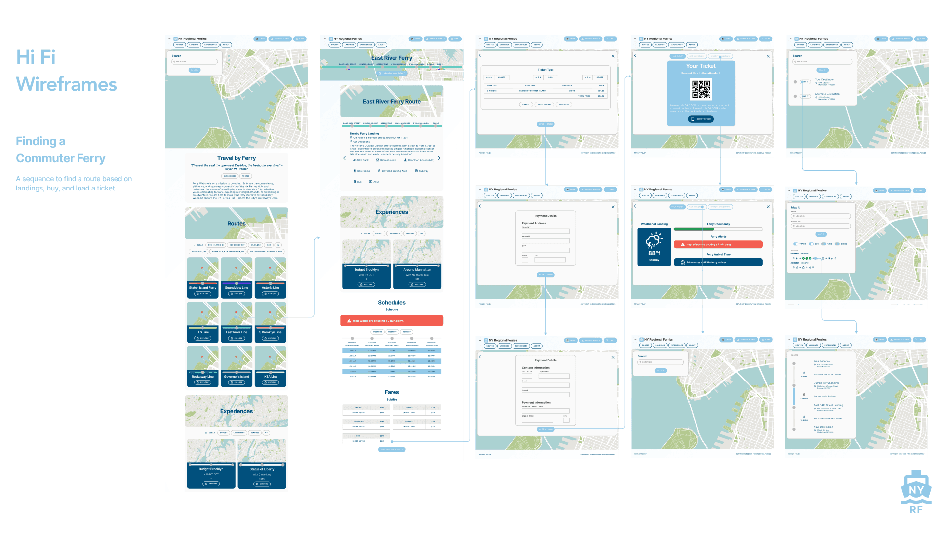
Finding a Commuter Ferry, Planning Transit, & Buying a Ticket
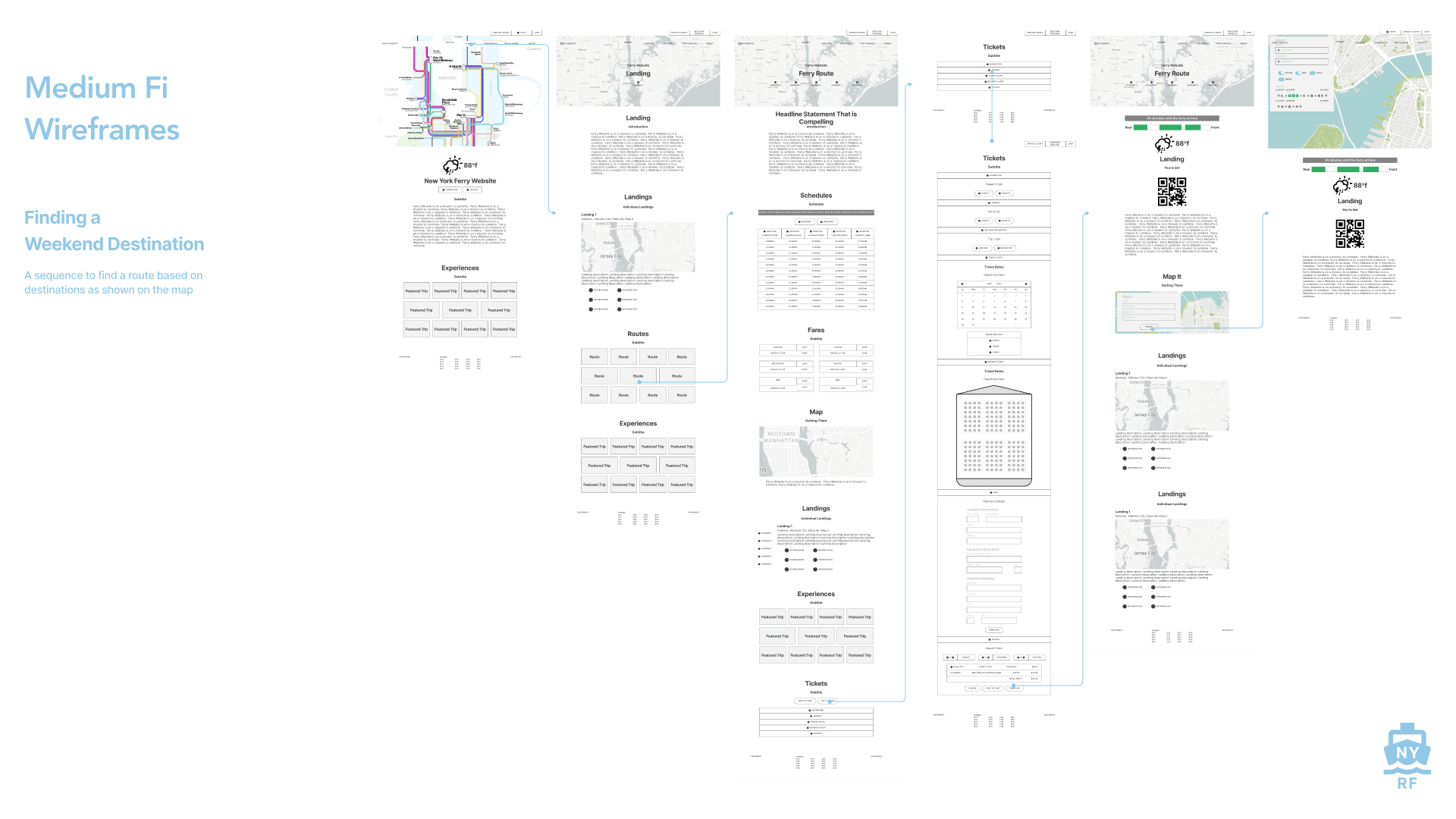
Finding a Weekend Destination, Planning Transit, & Buying a Ticket
Finding a Tourist Experience, Planning Transit, & Buying a Ticket

Developing the taskflows corresponds with the user personas. They are as follows:
Finding a Commuter Ferry, Planning Transit, & Buying a Ticket
Finding a Weekend Destination, Planning Transit, & Buying a Ticket
Finding a Tourist Experience, Planning Transit, & Buying a Ticket
Developing the taskflows corresponds with the user personas. They are as follows:
Finding a Commuter Ferry, Planning Transit, & Buying a Ticket
Finding a Weekend Destination, Planning Transit, & Buying a Ticket
Finding a Tourist Experience, Planning Transit, & Buying a Ticket
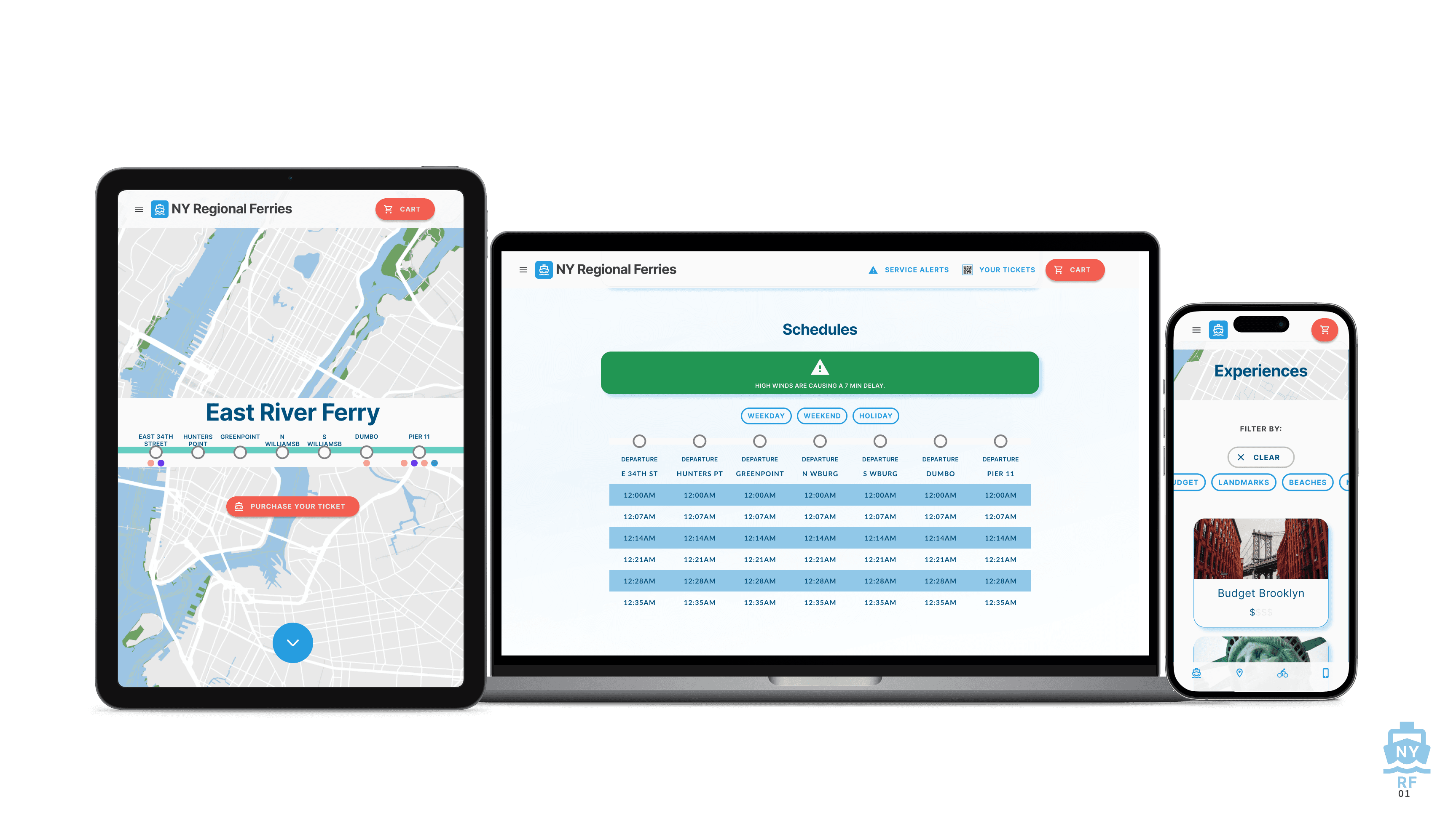
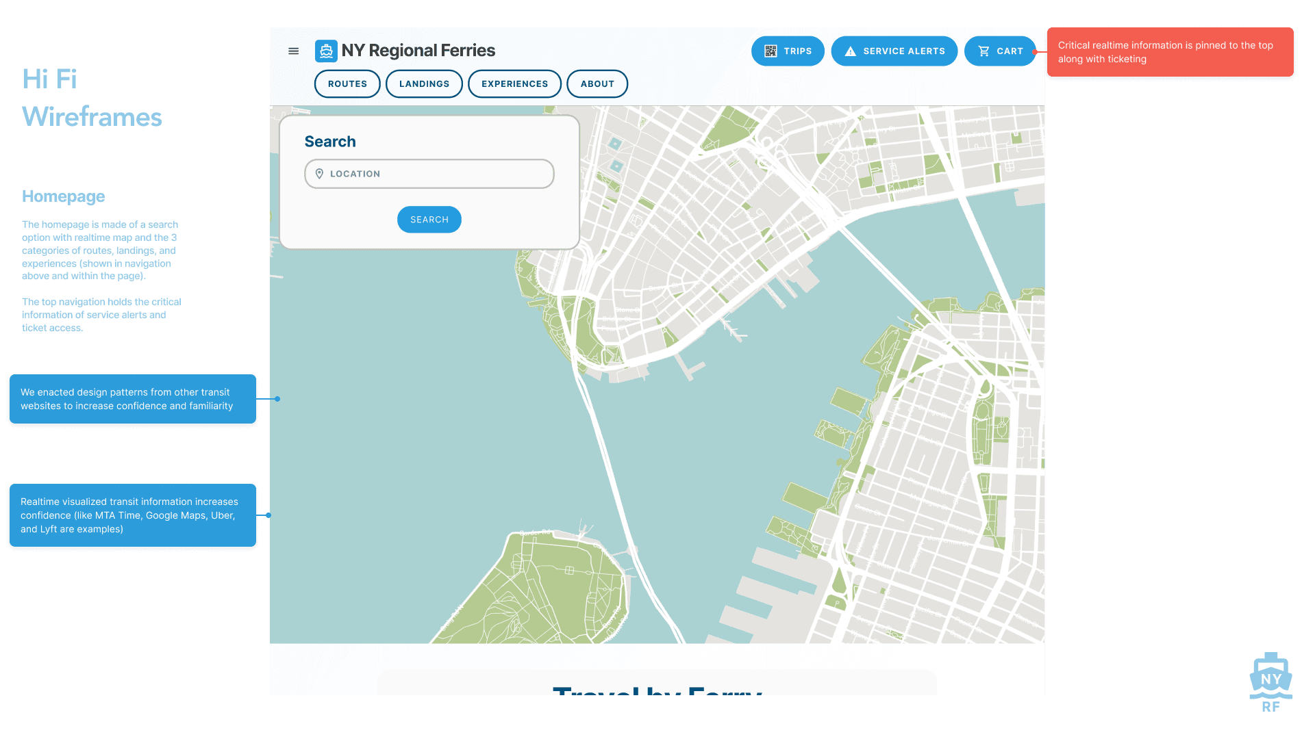
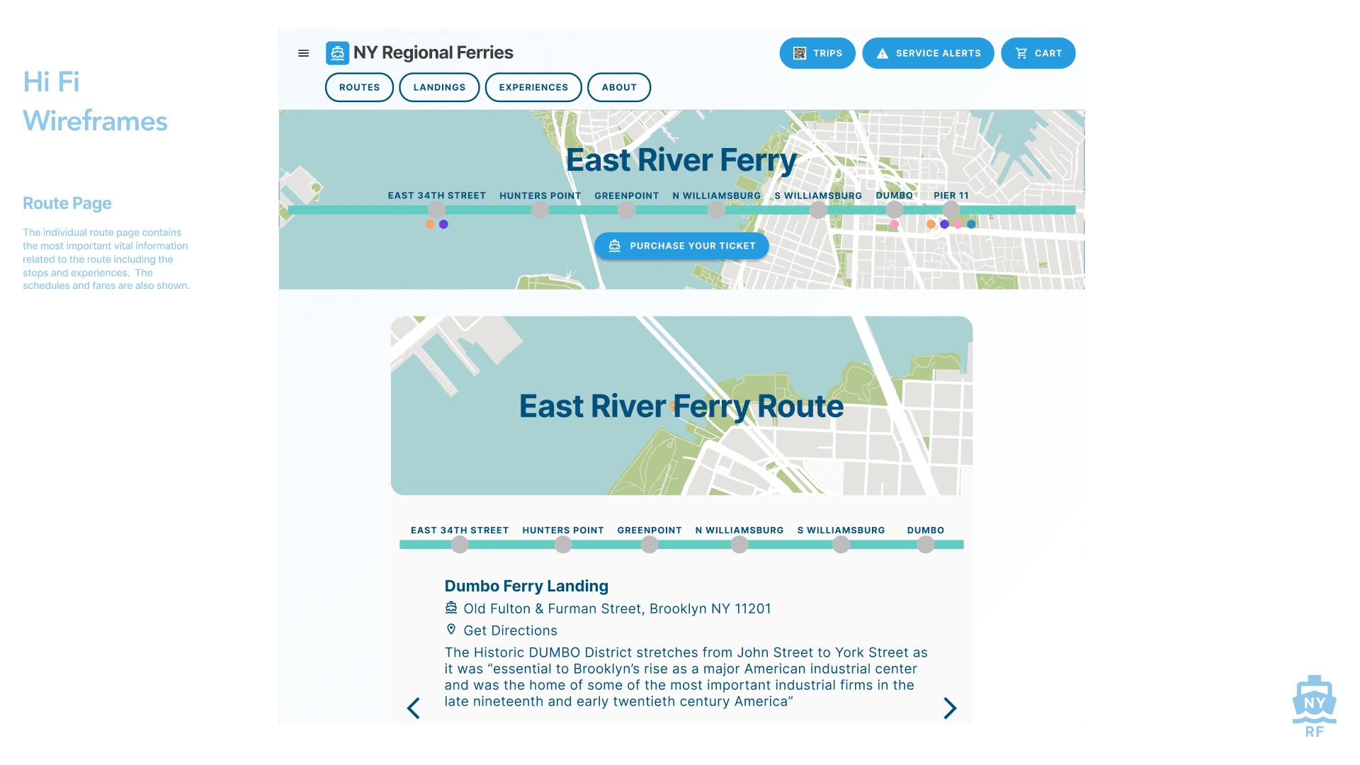
Elaborating on the taskflows we developed the visual wireframes that correspond. The focus was on gathering all the needed information while thinking deeply about the user needs determined previously to connect the dots.


Elaborating on the taskflows we developed the visual wireframes that correspond. The focus was on gathering all the needed information while thinking deeply about the user needs determined previously to connect the dots.
Elaborating on the taskflows we developed the visual wireframes that correspond. The focus was on gathering all the needed information while thinking deeply about the user needs determined previously to connect the dots.
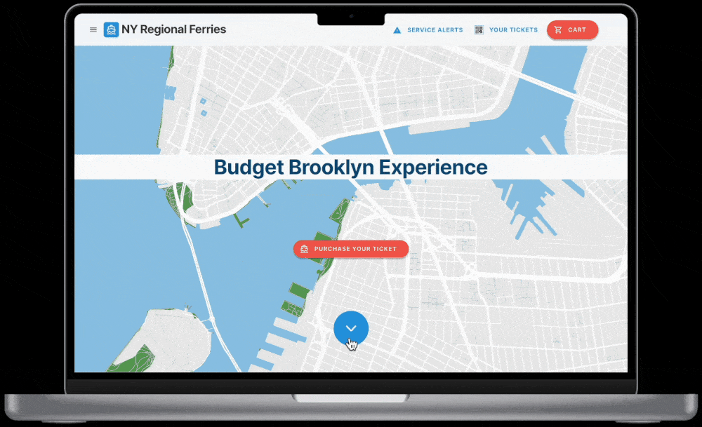
When proceeding to the Hi Fi wireframes we added the layer of UI decisions. Developing the color scheme, fonts, visual hierarchy, and feel of the website. Deeper thought is given to the HMW questions we previously determined; how do we answer these issues in the website?


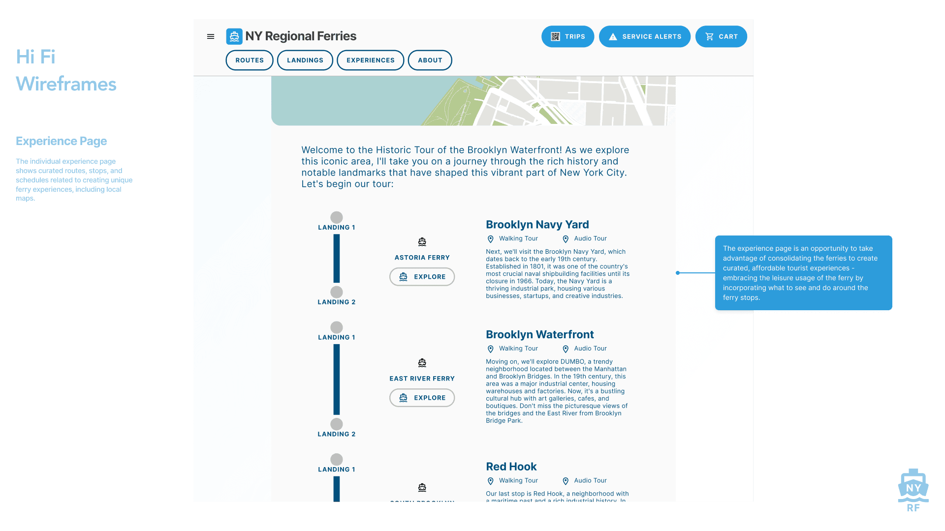


When proceeding to the Hi Fi wireframes we added the layer of UI decisions. Developing the color scheme, fonts, visual hierarchy, and feel of the website. Deeper thought is given to the HMW questions we previously determined; how do we answer these issues in the website?
When proceeding to the Hi Fi wireframes we added the layer of UI decisions. Developing the color scheme, fonts, visual hierarchy, and feel of the website. Deeper thought is given to the HMW questions we previously determined; how do we answer these issues in the website?
The brand harkens back to the midcentury transit map and environmental graphic design. It seeks to be clean, optimistic, colorful, and ordered and modular.
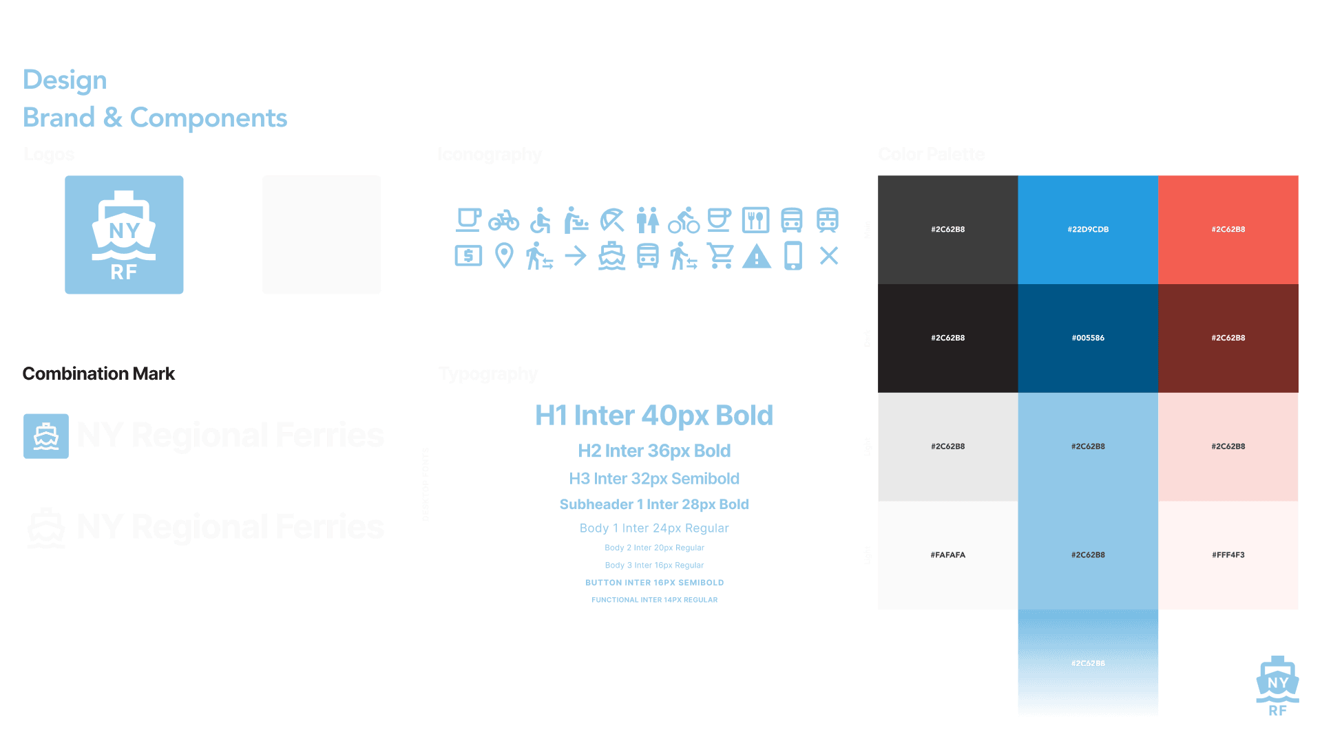
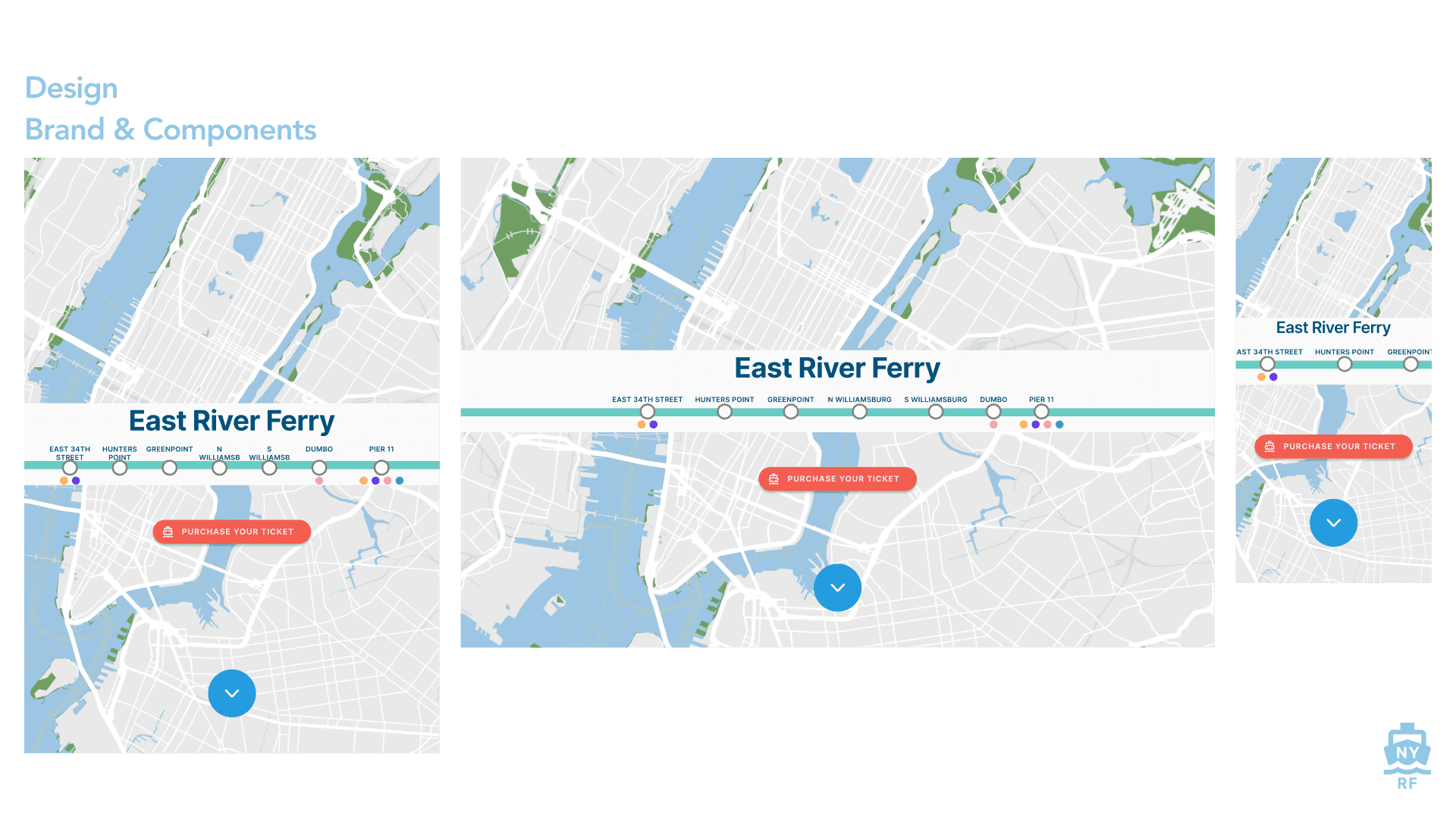


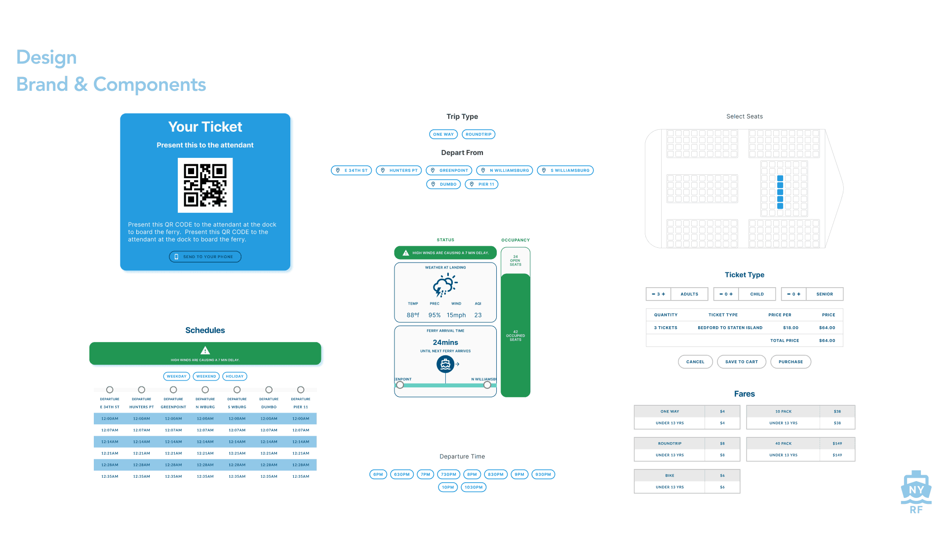
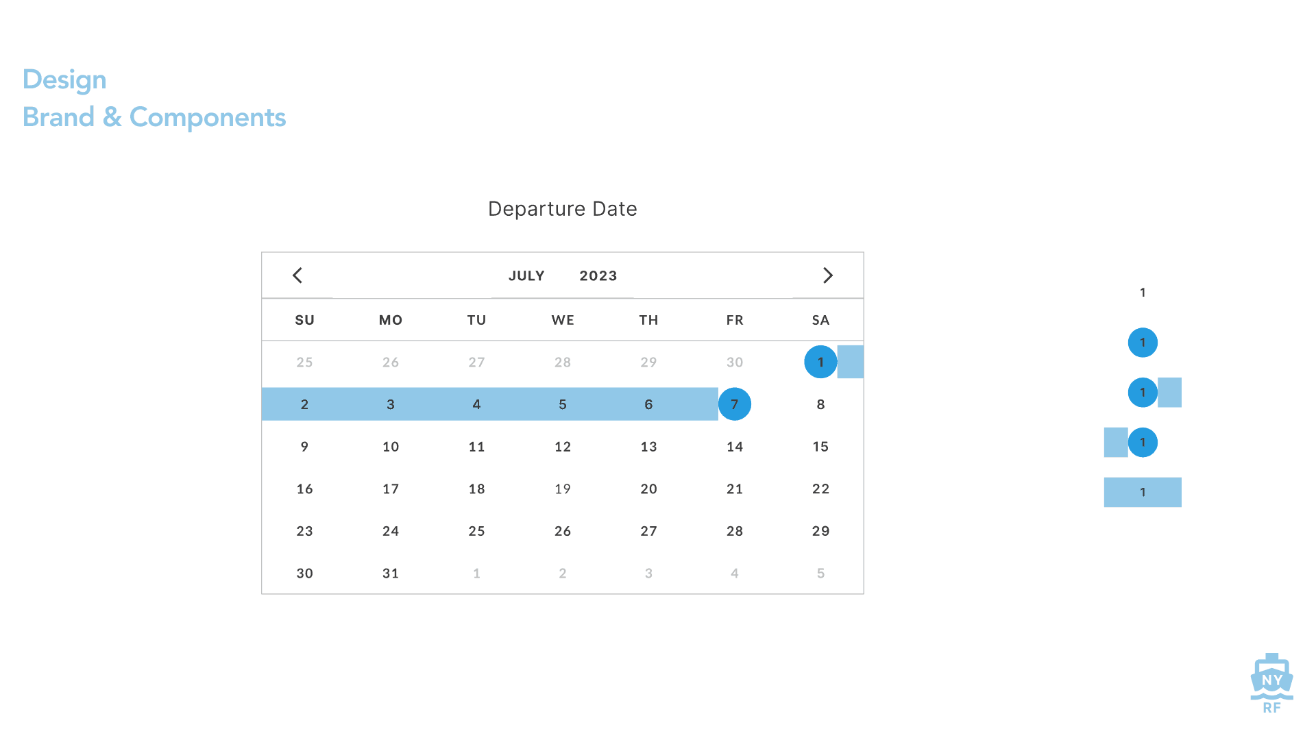


The brand harkens back to the midcentury transit map and environmental graphic design. It seeks to be clean, optimistic, colorful, and ordered and modular.
The brand harkens back to the midcentury transit map and environmental graphic design. It seeks to be clean, optimistic, colorful, and ordered and modular.
Deliver
The culmination of the iterations and research is embodied in the Deliver phase. User testing is a testing ground for the ideas proposed and a way to see if we are doing what we actually say we are doing. Also, we can find unanticipated, unrelated basic issues. We can gather the findings and package it in this final iteration.
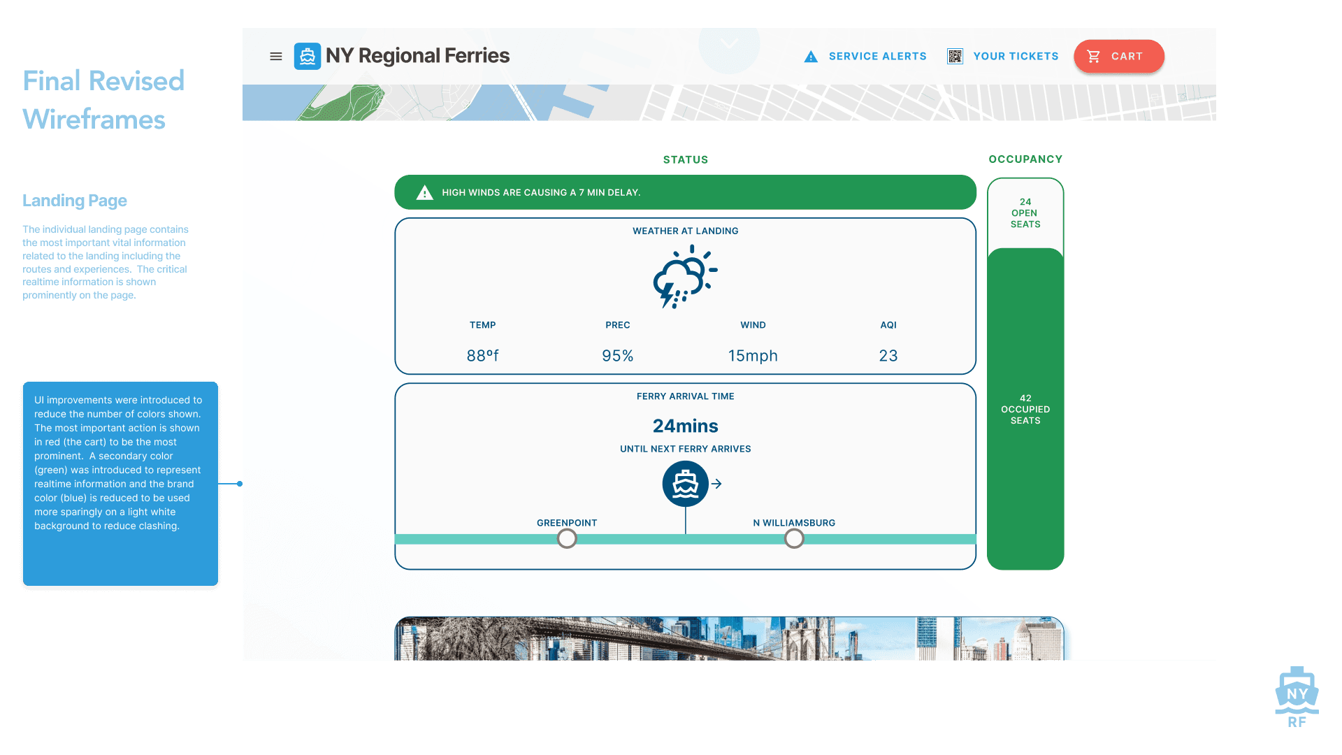
User testing for the led to a large number of improvements in the design.
The home menu was revised to display by default making sorting by category much more obvious.
The homepage was improved by listing out all 3 categories of lines, experiences, and landings.
The search experience was widened to include all of the following as well to include door to door directions.
Bbasic navigation tools such as back arrows and closing buttons for the interface were added.